While Amazon Web Services have gotten most of the attention in topics relating to the public cloud, Azure is gaining more and more traction, especially in the last year. For those with an Azure enterprise agreement agreement, you get four additional benefits compared to a usual Azure Pay-As-You-Go Subscription. One of these benefits is another portal to manage their Azure Subscriptions. Microsoft Azure Enterprise Portal (ea.azure.com, previously ea.windowsazure.com) is one of the most important portals for the company. It has two functions in particular:
- Bring your company hierarchy into Azure
- Browse usage and billing information
In this article, I want to dive more into the usage and billing information topic by introducing you to Power BI. I will show you how to easily provide reports regarding costs within Azure and provide some additional information on why you shouldn’t use the Azure Enterprise Portal to manage your costs.
If you need more information about the Azure Enterprise Portal, such as roles within the portal, you can learn a lot from Channel 9 on Microsoft’s site. The videos there show you almost everything you need to know when working with the portal.
Now, let’s begin!
The problem
In the portal, you can quickly get an overview in regards to the overall consumption (overall costs) inside your Azure Enterprise Agreement. However, if you want to drill down into specifics, such as how much did my Azure resources per subscription cost during the last 12 months?, the only option from within the portal is to download a usage report in the form of a CSV file–which perhaps isn’t so useful.
Depending on how many subscriptions you manage with the Enterprise Agreement, the downloaded report can be very complex and huge. For example, 20 subscriptions that run up to one year for test and dev purposes,will produce a CSV-file with a size of around 7 MB. (This may vary depending on how many resources you have in each subscription, etc.)
The solution
With regards to this problem, Power BI can show you a graphical overview on the aggregated costs per subscriptions over the last 36 months of your Azure Enterprise Agreement. These highly customizable overviews, or so called “dashboards,” can be shared with other stakeholders in the company. The big advantages are that all the billing and consumption data is stored the cloud in a web-based dashboard which can not only be shared, but even be integrated in your own mobile apps or web apps.
For a more detailed view on how to integrate the Power BI reports inside an app, have a look at this blog post from the Azure Blog.
Power BI overview
Power BI is an interactive BI (Business Intelligence) tool for data visualization. It allows the user to import data out of several different sources. It follows an exemplary listing of sources, which should show the huge variation of data sources:
- Files
- CSV-Files
- Excel-Files
- Databases
- Azure SQL Database
- Azure SQL Data Warehouse
- SSAS (SQL Server Analysis Services)
- Services
- Application Insights
- Microsoft Dynamics NAV
- Microsoft Azure Enterprise Agreement
The best thing is, it’s free for the standard model and it’s very simple to create informative charts with it. So let’s create an Azure cost overview dashboard!
Step by Step – Create an Azure cost overview dashboard
By the end of this step by step guide you should be able to create a dashboard on your own, similar to this one:
Create Power BI account and connect to your Azure Enterprise Agreement
A guide on how to create a Power BI account can be found in the EA Portal. Following the guidelines on the page in the portal, you can easily create an account and connect your Enterprise Agreement to it:

After you create the Power BI account and access the Power BI console, you need to connect your Azure Enterprise Agreement. Add a service on the dashboard page:

Search for the word “Enterprise” and you will find the Content pack “Microsoft Azure Enterprise:”

After clicking the button “Get,” provide your Azure Enterprise Agreement contract number as well as your API Access Key. Afterwards, the configuration and importation will begin.
You will be overwhelmed by the simplicity and power of this product as soon as all the data is imported. Power BI will create a default dashboard which is pretty good on its own. The dashboard after importing the data looks something like this:
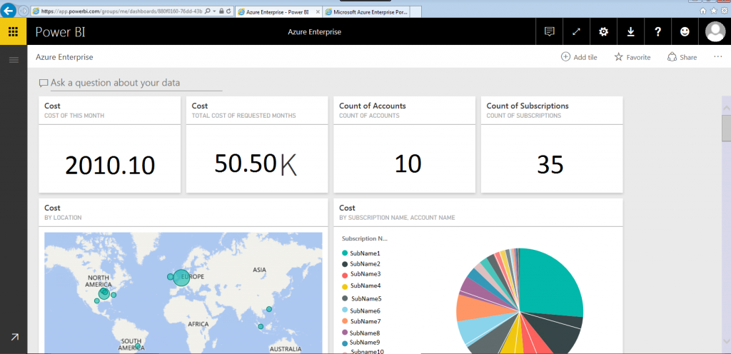
This page already gives a lot of information, but you can easily create your own customized dashboard and share it with your colleagues and stakeholders.
Create your own dashboard
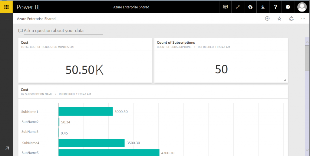
For creating you own dashboard, just go on your “Azure Enterprise” dashboard and on the top right click the three points sign and then click on “duplicate dashboard.”

After this process, you should have two copies of your dashboard. You can delete the tiles that you do not need and rename the dashboard based on what is relevant for you.
Create your own tile
Creating your own tile is also quite an easy step. On the top of your dashboard, there is a space provided for you to type in any questions that you might have about your data.

In my case, I wanted to have an overview of costs per subscription name. Therefore, I only needed to type “cost” and “subscription name” into the field.
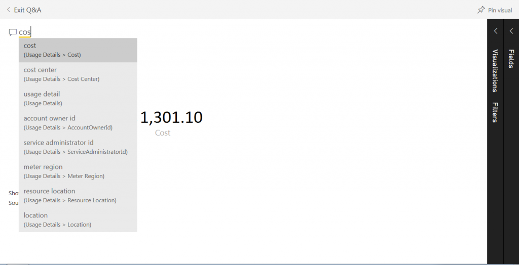
IntelliSense will give you some options while you are typing in the space provided. You will end up with something similar to this:
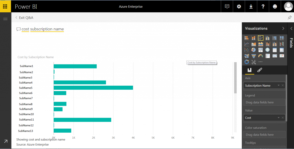
In the “Visualizations” pane on the right-hand side of the screen, you can change the chart type. To get it to show the numbers inside the tile, you need to turn on the data labels and edit the decimal to “two.” Then you end up with something like this:
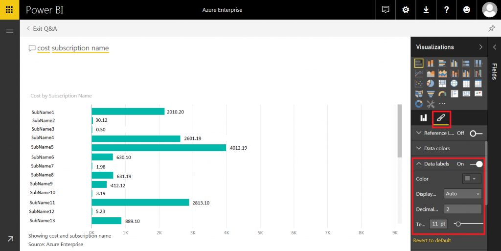
With the pin needle shown below visualizations, you can simply put this tile onto the dashboard. Once it is on the dashboard, you can resize it and change the shape according to your own personal preference or use.
Following these instructions, you can easily create dashboards and infographics using Power BI.
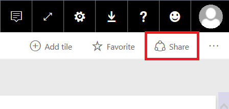
Share the dashboard
To share the dashboard with your colleagues and stakeholders, you simply need to click the share symbol at the top right of the screen:
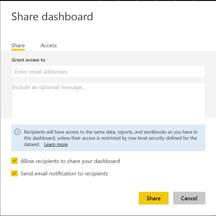
Once you click on it, you can enter the email addresses of the recipients. If you have registered with your Azure AD email address for Power BI, it will show you entries of other users in the same directory.
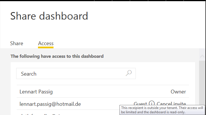
In the “Access” tab, you can see who has access to your dashboard fully and who has only limited access to it. Limited access is granted if you have entered a guest account (Read Only Permissions).
If you only want to share the data within a certain tile, you can click the three points icon on the top right of that specific tile. This will open up the tile menu and you can then simply export a CSV file with all the data in it. This is depicted in the picture below: 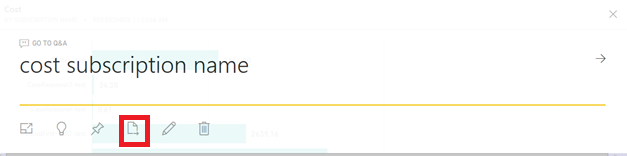
You may want to send reports/dashboards via email instead of share a link to web-based reports/dashboard. This is a planned feature.
Using Power BI in combination with the data produced by the Azure Enterprise Agreement, the possibilities of showing numbers are limitless. The ease of use is a big plus point for the product as well as the fact that the product is completely free to use (A comparison of Power BI for free and Power BI Pro can be found here).
If you are working with the Reporting API (upon which the EA Portal is built), you can also create a similar report using PowerShell and the API. However, the computing power that you need in order to calculate the costs per subscription is quite high. For example, you cannot outsource the PowerShell Code into Azure Automation because you will reach the memory limit.
Therefore, Power BI is one of the best tools for getting a cost overview about your Azure environment, also because you can easily integrate the API in your own application. Hopefully it will help you control your costs and maximize your Azure use.


So, you can’t customize any of the live graphs.