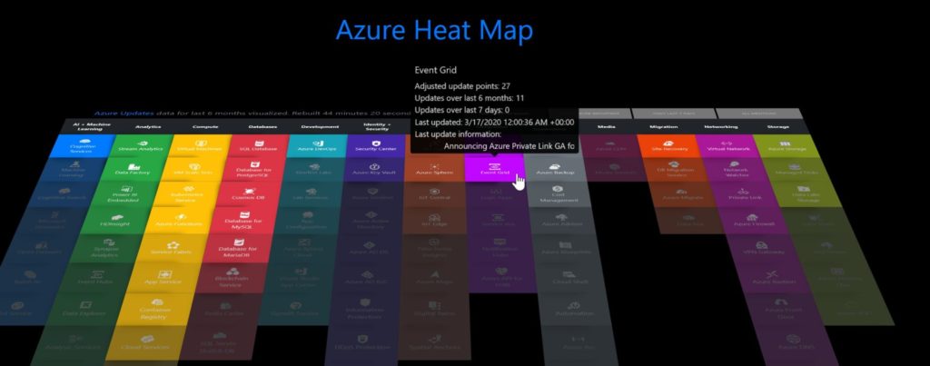
Azure is vast, and it is continuously changing its landscape to incorporate new services and features. Sometimes it is hard to keep it up even when working on it every single day (including weekends!). The Azure Charts website is a great resource that is visual and easy to navigate. The first page is the Azure Heat Map, which has the services divided by areas. We can see in traditional 2D or 3D (image below), and when we hover the mouse over, we have details about the feature, such as the number of updates in the last six months or seven days.
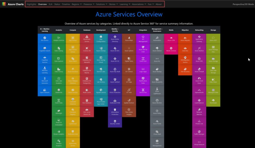
We have a variety of easily accessible views. In the Azure Services Overview, we have the same map of services and areas.
Here we have more updates about the Azure Blueprints, including reference architectures and even learning modules. Pretty cool, eh?

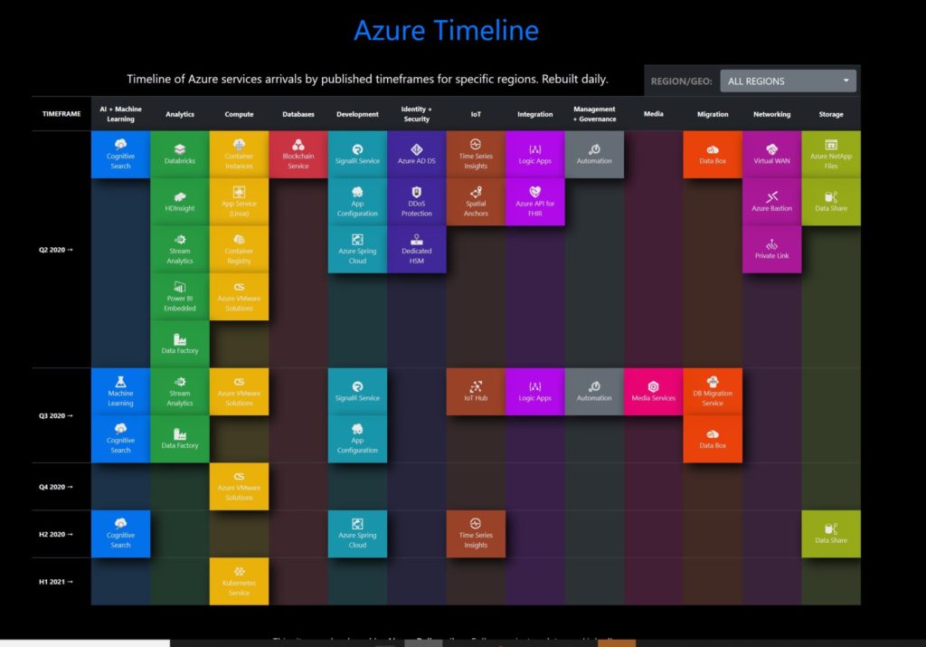
Another cool feature is the Azure Timeline, which shows when the services will be available in any given region.
There is a lot of cool stuff on this site and is an excellent resource to have during a discussion with your team, customers, and when designing solutions in Microsoft Azure.
The team behind the Azure Charts was kind enough to show how they design the solution for this application. You can check it out on the About section.